Case
study:
aspen fiber networks
Aspen Fiber Networks, a provider of advanced technology and networking solutions, required a fresh brand identity to solidify its presence in a competitive industry. The primary goal was to create a cohesive and professional look that would convey trust, innovation, and technical expertise while resonating with both corporate clients and modern businesses seeking reliable tech solutions.
Objectives
- Establish a Recognizable Brand Identity: Develop a professional and modern brand aesthetic that would reflect Aspen Fiber Networks’ commitment to cutting-edge technology and connectivity.
- Create Consistent Marketing Materials: Design cohesive visuals and guidelines that would ensure brand consistency across digital and physical platforms.
- Enhance Brand Appeal to Target Audience: Appeal to businesses looking for comprehensive and reliable technology services through effective visual communication.
Design & Visual Approach
To meet the project’s objectives, a clean, contemporary design with a vibrant yet professional color palette was implemented:
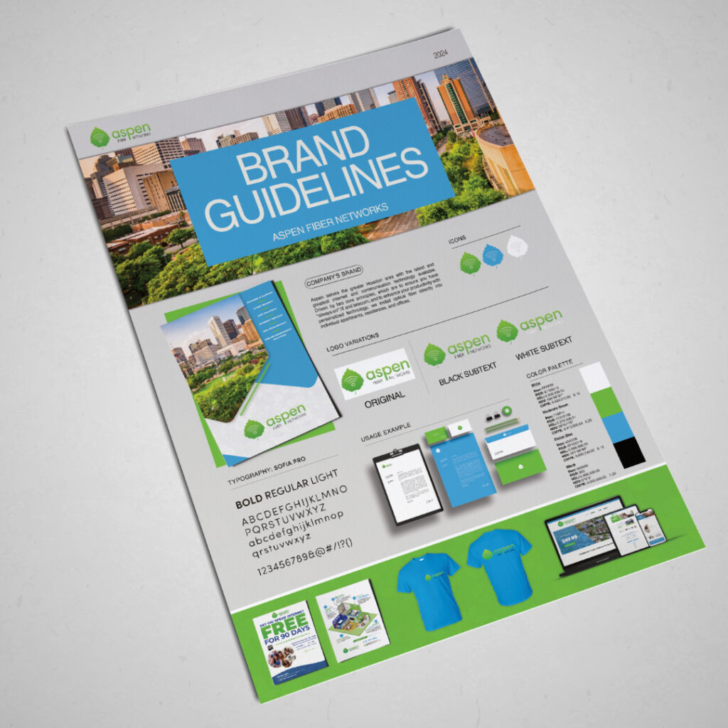
- Color Palette: The main colors included a fresh green and a stable smokey black, reflecting a balance between innovation and reliability.
- Logo Design: The Aspen logo features a stylized leaf with signal waves, symbolizing connectivity and growth. The green gradient aligns with natural elements, while the symbol conveys Aspen’s commitment to providing strong, far-reaching network solutions.
- Typography: A bold, sans-serif font (Sofia Pro) was selected to maintain clarity and professionalism, aligning with the brand’s modern and trustworthy image.
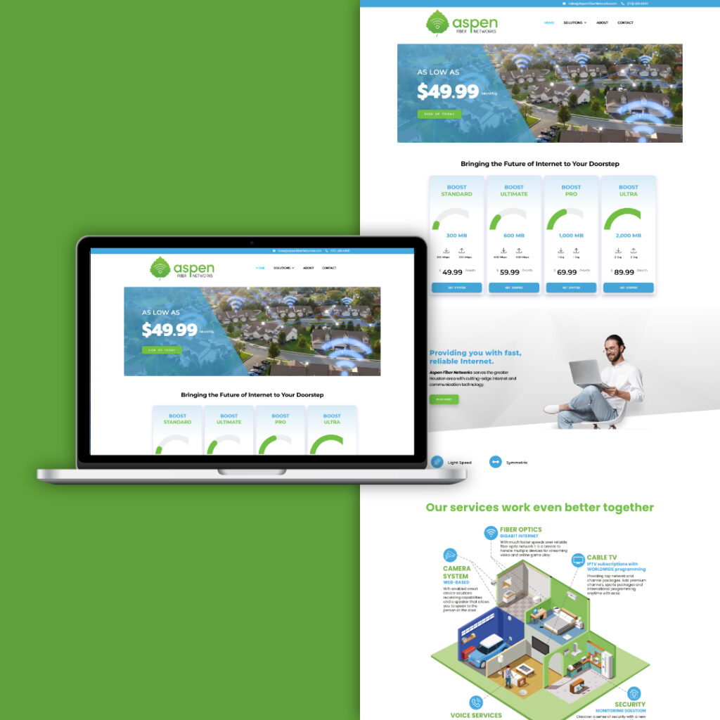
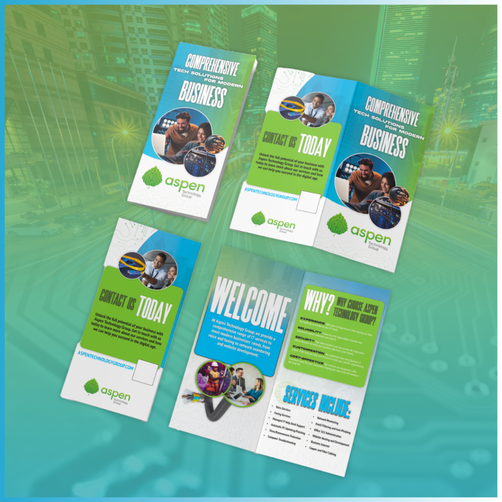
- Usage Examples: Application of the brand elements extended to business cards, brochures, brand guidelines, and digital ads, providing a unified look across all platforms.
Challenges
- Maintaining Technical and Approachable Appeal: The brand needed to convey expertise in fiber and tech solutions without alienating less tech-savvy clients.
- Ensuring Consistent Branding Across Materials: Creating a cohesive identity that could be easily adapted for a variety of marketing materials, both digital and print.
Solutions
- Comprehensive Brand Guidelines: Detailed brand guidelines were created to outline logo variations, color usage, typography, and other essential elements, ensuring consistency across all platforms.
- Professional Collateral: A suite of branded materials, including brochures, business cards, and digital ads, was designed to be visually cohesive and reflect the brand’s professional tone.
- Clear and Compelling Messaging: Marketing materials emphasized Aspen’s tech expertise while remaining accessible and focused on the client’s benefits, enhancing brand appeal across audiences.
Results
The rebrand successfully positioned Aspen Fiber Networks as a reliable, modern, and professional player in the tech space. The visual consistency and clear messaging contributed to an improved brand perception and recognition within the market.
- Enhanced Brand Recognition: The cohesive brand elements improved visibility and recognition, reinforcing Aspen's position as a trusted technology provider.
- Increased Client Engagement: Updated marketing materials and a fresh brand identity attracted attention and engagement from potential clients.
- Improved Internal Alignment: The brand guidelines provided a solid framework for Aspen’s team, ensuring that all communications reflected the brand’s identity accurately.
Conclusion
Aspen Fiber Networks’ rebrand is a testament to the power of cohesive design and clear messaging. Through clean visuals, a balanced color palette, and professional collateral, Aspen now has a strong foundation to communicate its expertise and build trust with clients. This rebrand solidifies its commitment to providing reliable and innovative tech solutions for the modern business landscape.