Project Overview
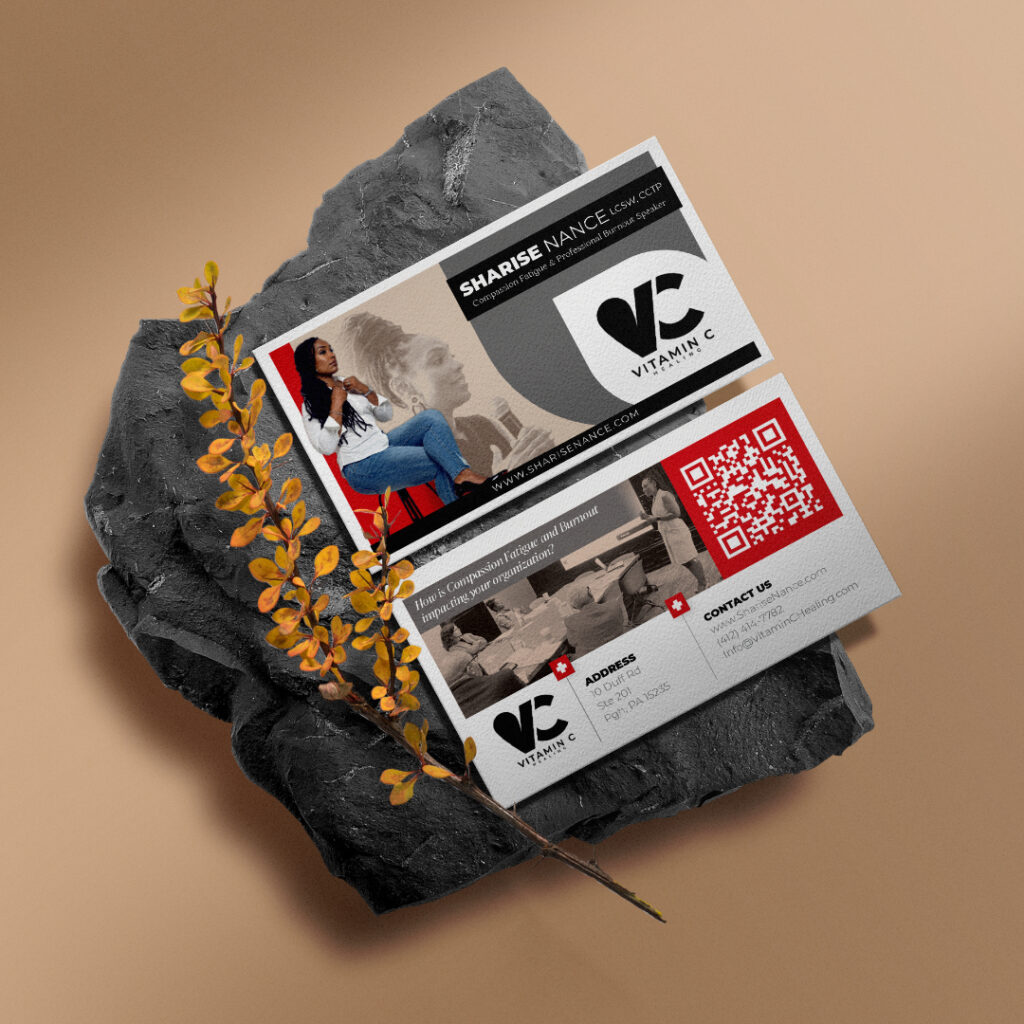
Vitamin C Healing, founded by Sharise Nance, LCSW, CCTP, is a brand focused on compassion fatigue, wellness, and professional development. The brand provides workshops, consultations, and speaking engagements designed to prevent burnout and promote resilience among professionals. The objective of this project was to create a professional and approachable brand identity that reflects Vitamin C Healing’s commitment to empathy and mental well-being in the workplace.
Objectives
- Create a Professional Yet Approachable Brand Identity: Develop visuals that convey Sharise’s authority as a speaker and therapist, while also capturing the warmth and empathy central to Vitamin C Healing’s mission.
- Enhance Engagement Through Print Media: Design engaging and informative marketing collateral that can be distributed at events, conferences, and workshops.
- Incorporate Modern Design Elements: Ensure that the design feels fresh, relevant, and easy to recognize, strengthening brand recall.
Design & Visual Approach
The visual identity for Vitamin C Healing was crafted to balance professionalism with a touch of warmth and approachability. Key design elements included:
- Color Palette: The design features a refined color scheme of neutral tones with accents of vibrant red, representing both compassion and energy. The neutral tones evoke professionalism, while the red draws attention to key information.
- Typography: Bold, modern fonts were selected to reflect strength and clarity. The typography reinforces Sharise's role as a trusted speaker and professional in the mental health and wellness industry.
- Logo Design: The “VC” logo for Vitamin C Healing is clean and simple, creating a memorable mark that is easily recognizable. The logo’s minimalism reflects the brand’s focus on clear communication and support.
- Imagery: The use of Sharise’s professional photos reinforces her expertise, while softer images in grayscale backgrounds add warmth and focus on the brand's theme of compassion and support.
- QR Code Integration: A QR code was added to the collateral, offering a modern touch that allows clients and attendees to easily connect with Vitamin C Healing’s digital presence.
Challenges
- Conveying Empathy Without Losing Professionalism: It was essential to present the brand as caring and supportive, without sacrificing the authority and professionalism that Sharise represents.
- Maximizing Information in a Compact Design: The design needed to include all essential contact details, brand messaging, and imagery, while maintaining readability and visual appeal.
Solutions
- Balanced Visuals: By combining warm images and professional typography, the design successfully conveys empathy and professionalism, creating a look that is both trustworthy and approachable.
- Compact, Functional Layout: The layout was structured to include all necessary information while maintaining a clean and organized look. The QR code placement further enhanced accessibility, encouraging quick engagement with the brand.
- Targeted Messaging: The messaging was focused on promoting Sharise’s key services, emphasizing her role in preventing compassion fatigue and burnout, making the collateral immediately relevant to her target audience.
Results
The branding materials for Vitamin C Healing successfully strengthened Sharise’s presence as a leader in mental wellness and resilience, appealing directly to professionals seeking support in managing compassion fatigue.
- Increased Brand Recognition: The cohesive and professional design elevated Vitamin C Healing’s image, making it memorable among industry professionals and clients.
- Improved Client Engagement: The QR code and clear contact information encouraged potential clients and attendees to engage with the brand through multiple channels.
- Positive Feedback on Visual Appeal: The professional yet approachable branding was well-received, with clients noting the clarity and warmth of the design.
Conclusion
The branding for Vitamin C Healing demonstrates the impact of combining empathy with professionalism in design. Through careful selection of colors, typography, and layout, the brand was able to achieve a look that feels both supportive and authoritative, resonating with professionals who prioritize mental well-being. This case study highlights the importance of visual identity in building trust and connection within the wellness industry.


