let's get deep
chef byron


Client Overview
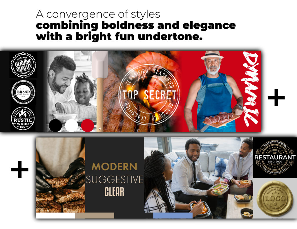
Chef Byron is a culinary entrepreneur seeking to establish a memorable, modern, and approachable brand identity. The brand’s mission is to offer a premium, friendly experience that resonates with food lovers and clients who appreciate high-quality, well-prepared dishes. Chef Byron wanted a brand that was not only dynamic and engaging but also versatile enough to work across multiple applications, from digital to merchandise.
Challenge
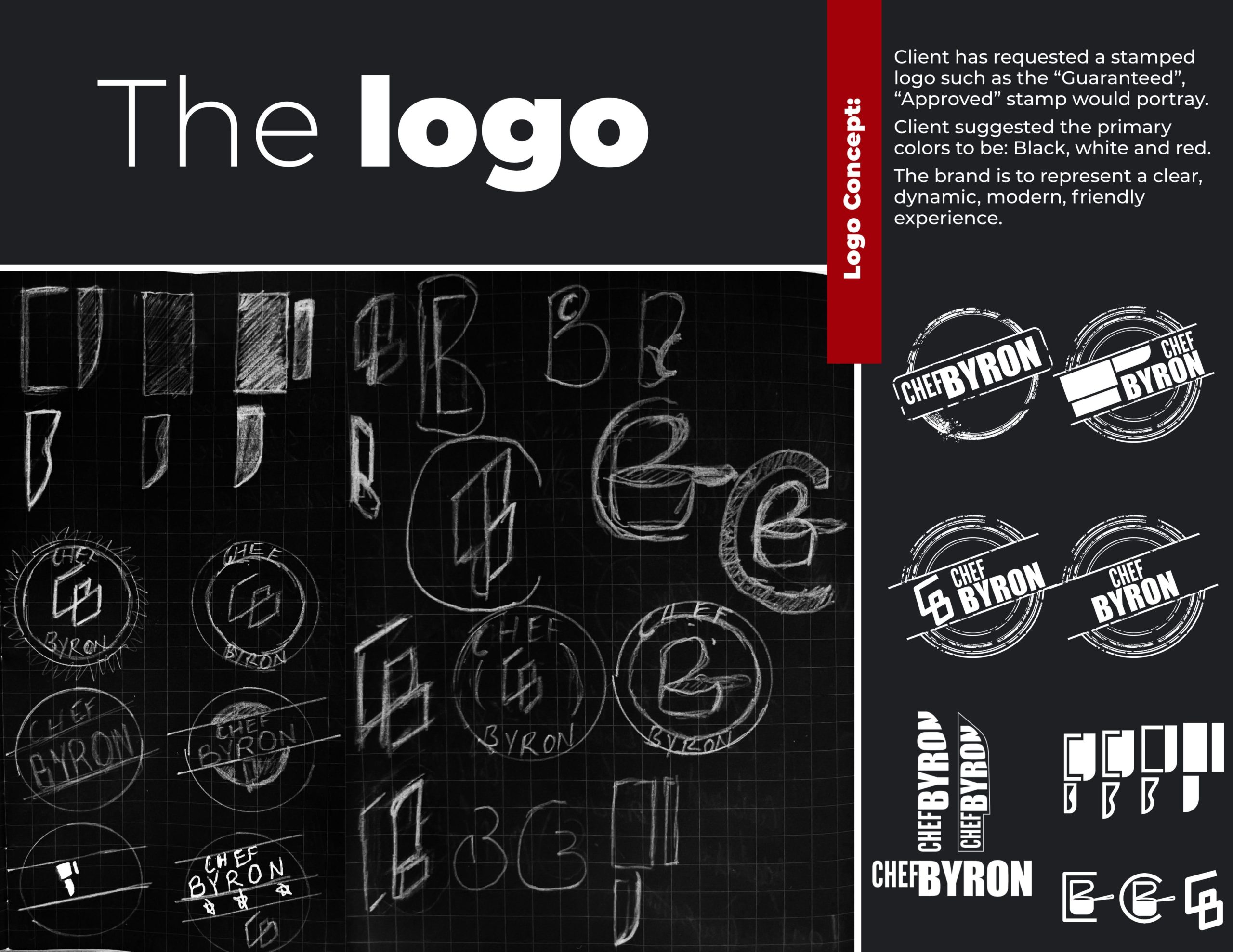
Chef Byron needed a logo and branding elements that conveyed quality and authenticity while remaining accessible and inviting. The goal was to create a logo that would serve as a visual stamp of approval—similar to a “guaranteed” or “approved” stamp. Primary colors were black, white, and red to evoke a sense of modernity, energy, and boldness. Additionally, the brand had to resonate across digital platforms and physical products, such as apparel and merchandise, to strengthen brand recognition and engagement.
Solution
To meet these needs, I developed a visual identity that emphasized Chef Byron’s commitment to quality and modern appeal. Here’s how I approached it:
- Logo Design and Concept Development:
- Created a series of stamped logo variations that echoed the “approved” or “guaranteed” concept. This approach reinforced the idea that Chef Byron’s food is trustworthy, premium, and satisfying.
- Incorporated dynamic, bold typography to represent the brand’s strength and modernity while ensuring readability and impact at various sizes.
- Digital Applications:
- Developed responsive logo headers for use on the website and mobile platforms, ensuring consistent branding across digital touchpoints.
- Designed app icons and social media profile images to create a cohesive and recognizable digital presence, making it easy for followers and clients to engage with the brand online.
- Merchandise and Apparel:
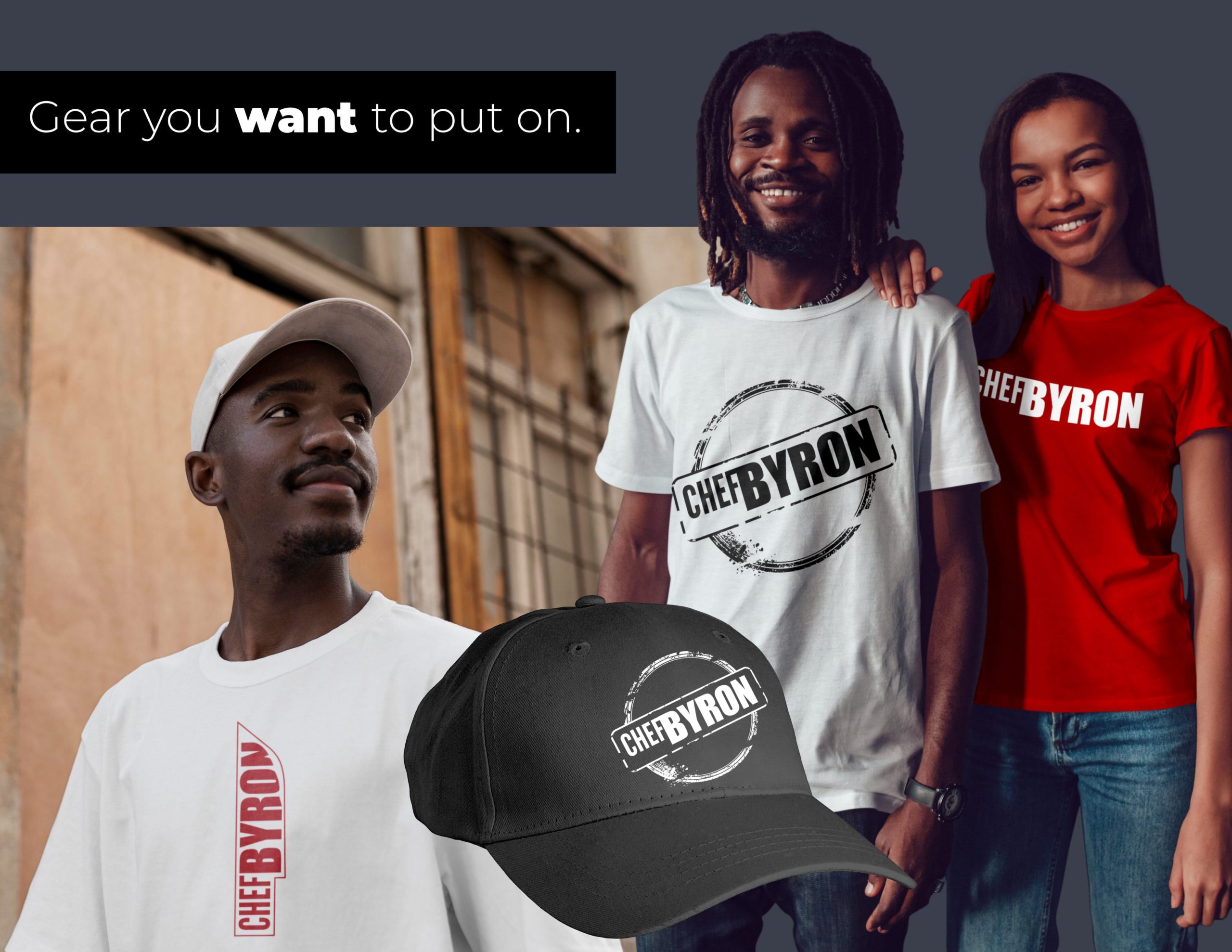
- Created branded merchandise mockups, including t-shirts and caps, that align with the bold and accessible brand vibe. The merchandise reinforces brand recognition and offers fans a way to connect with Chef Byron’s brand on a personal level.
- Client Persona Creation:
- Crafted a persona representing Chef Byron’s target audience, the “Foodie Family,” highlighting their goals, values, and lifestyle. This helped tailor the brand messaging to resonate with the intended audience, creating a deeper connection and engagement.
Results
The final branding package for Chef Byron successfully captured the desired brand personality: bold, friendly, and dynamic. Key outcomes include:
- Increased Brand Recognition: The stamp-style logo is immediately recognizable and conveys quality, which aligns with Chef Byron’s commitment to delivering top-notch culinary experiences.
- Consistent Digital Presence: The brand’s digital assets are cohesive and tailored for various platforms, from social media to mobile websites, making it easy for followers to stay connected.
Enhanced Merchandise Appeal: The branded apparel provides fans with an opportunity to promote and feel connected to Chef Byron’s brand in a tangible way, extending the brand’s reach.
Let’s Make Your Brand Impossible to Ignore.
In a world full of noise, your brand deserves to stand out and make an impact. Let’s create visuals and messaging that demand attention and drive connection.


